Judging a book by its cover in the digital age
 Back in 2011 when I decided to self-publish my first novel I asked my friend Betsy if she’d be interested in
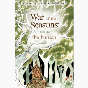
painting a cover. She was, and after some discussion she went to work and produced the most perfect and stunning cover ever! It was exactly what I wanted (it still is!), and over the years I’ve had so many people tell me how much they love the covers of all my War of the Seasons books. They harken back to fantasy books of old and are simply beautiful.
Now here comes the “but.”
What I didn’t consider was that we were moving into a digital age and how important the thumbnail image would be, especially to me, as I sell about 100 ebook copies to every 1 print copy of my War of the Seasons novels. The thumbnail for The Human was very difficult to see the title and nearly impossible to discern what the image was.
 So I made the decision to have an alternate cover for done up for the ebook version of my novels. I asked my friend Kelli Neier (she did the cover layout for my War of the Seasons novels, and has several stunning graphic design covers under her belt), if she could come up with an eBook cover for The Human. We went through several iterations and showed them to my teenage daughters and friends of mine, taking in their feedback (it looks like a romance cover, she doesn’t look like Story, shouldn’t spring be a theme, etc) and working from there, but always keeping in mind what it would look like as a thumbnail (bigger title, a simple image to focus on, etc). I think we went through 3 or 4 variations until we decided on this one.
To quote my daughters when they saw it: “I would buy that book right now!”
The reaction when I first tested it out on Wattpad was interesting. I had several people say they loved the new cover, and many others say they read the story because they saw the cover while they were browsing and were interested. And of course, there were a couple people who asked me to change it back to the old cover because they really loved it. I compromised by hosting the print book cover as media on each of the uploaded chapters there, and again, the “old” cover will always be the print book cover, which is, given the circumstances, the best I think I can do. Only time will tell if it will make a difference.
All that said, I definitely learned a valuable lesson, and in the future will always keep the thumbnail in mind when it comes to my covers.
~ ~ ~ ~ ~
As a reminder, I have a kickstarter going on RIGHT NOW! If you want to see more diversity in the Superhero genre, please come right this way...


